


Hi! I’m Nienke Kersten, brand designer and allround creative born, raised and based in Amsterdam. With years of experience I have honed my skills in creating anything from logos, websites, packaging designs to full campaigns and brand identities.
Whether you're a startup looking to establish a strong brand identity or an established business in need of a visual update, I'm here to help. Not sure where to start or what you need? Get in touch! Whether it’s a one-day brand assessment, a full rebrand or anything in between, together we can determine what’s best for your business.
In an ideal world I’d only work for NGO’s and other people / companies that are here to try save this planet, help the less privileged in society or contribute to it in a cultural sense. So please reach out if that’s what you’re looking for in a creative <3
Client list:
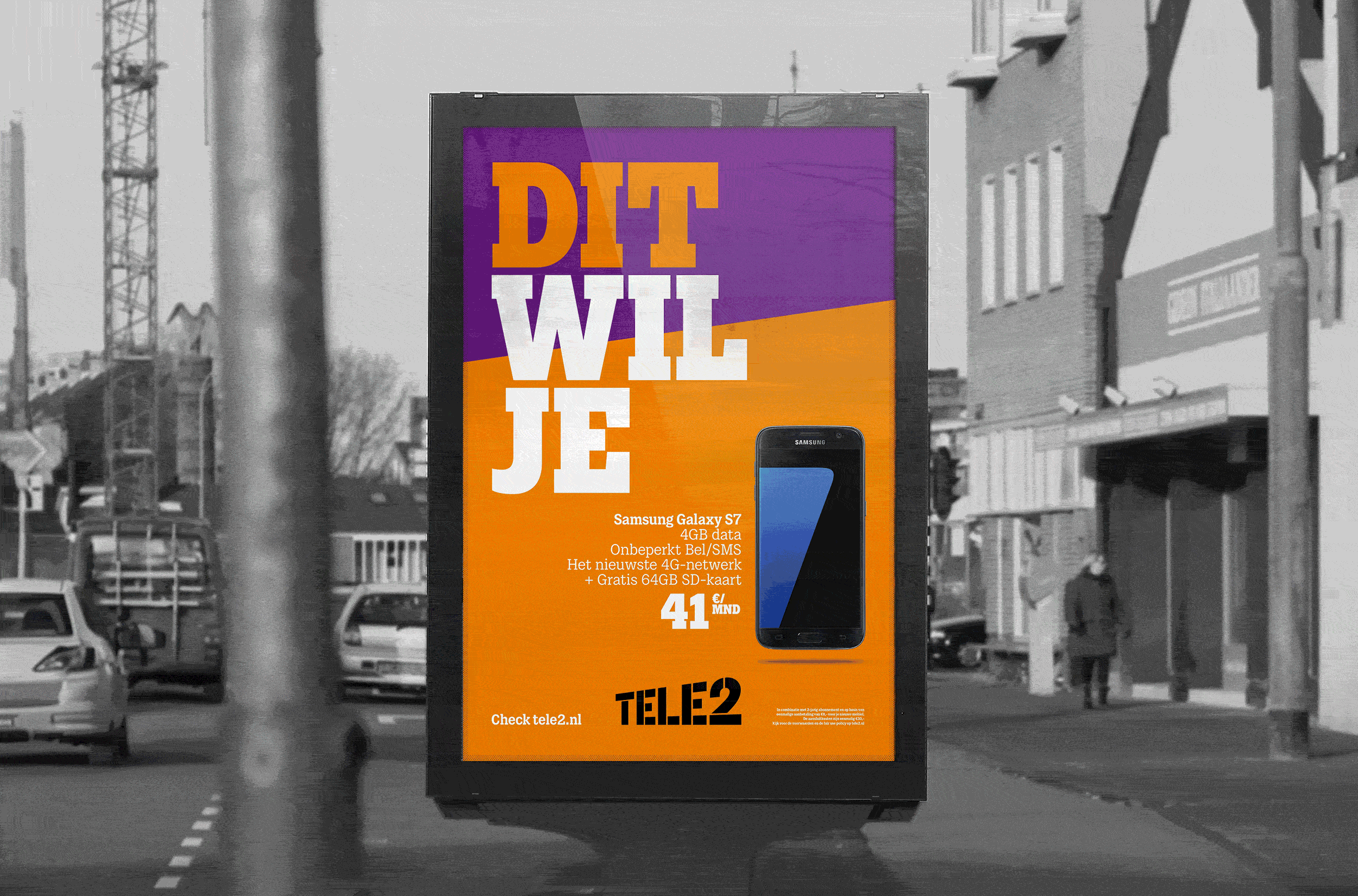
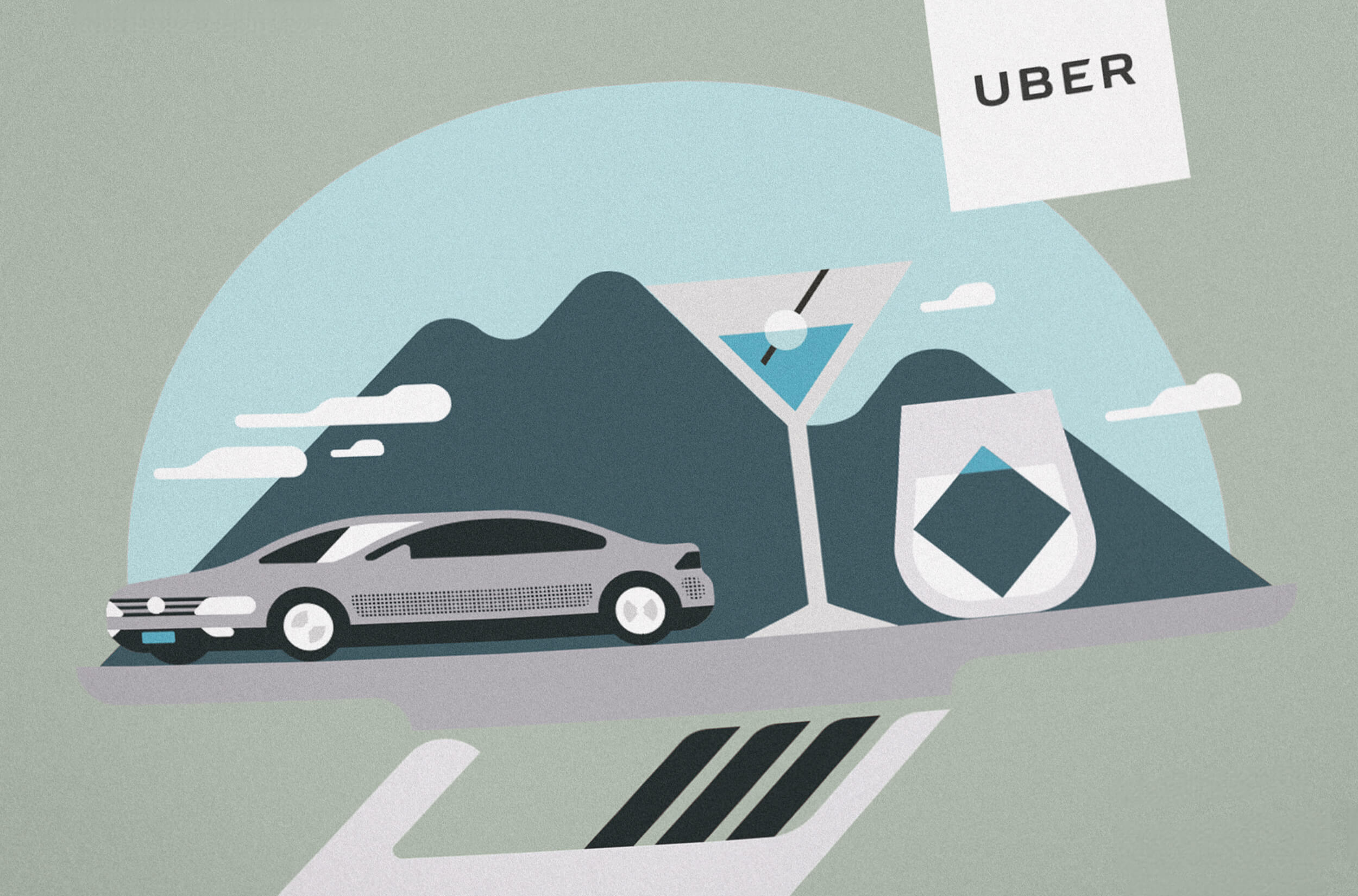
Yamba Health, VOOD, Mana-Ma Yoga, doemeemetmdt.nl, Uber, Tele2, Adobe, House of Balance, Brand Bier, KPN, Albert Heijn, ABN Amro, Randstad, Nationale Nederlanden, NIBC Vastgoed Hypotheken, Heineken, Royal Canin, Mediacollege Amsterdam, McDonald’s, KLM, Lexus, ESPN, Campina, T-Mobile, MG, NS, ViaPlay, Centraal Beheer, 3FM, Toyota, Toto, Unibet, Hak, Finlandia, Kruidvat, Appelsientje, Pandriks, Old Amsterdam, CarNext, Duyvis.
I'm a...
Brand designer
![]()
Conceptual thinker
![]()
Creative director
![]()
Pedal pusher
![]()
Thrifter
![]()
Volunteer
![]()
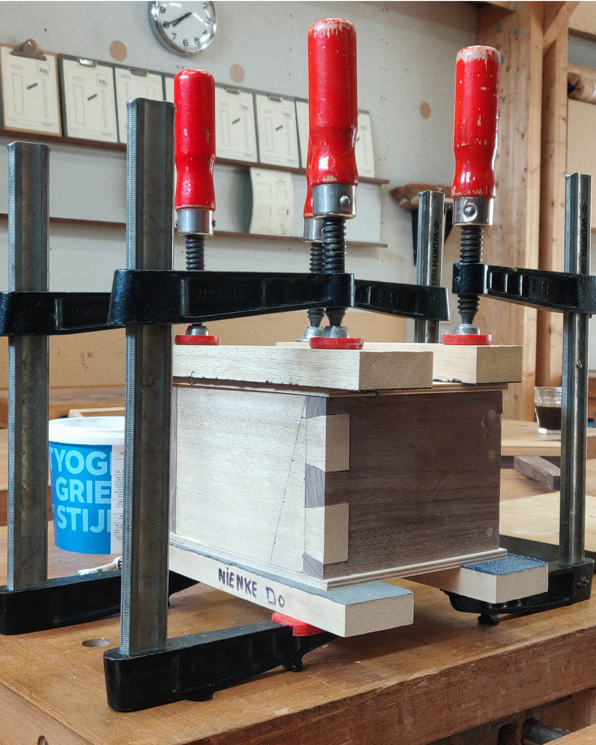
Woodworker
![]()
Vegan
![]()
Human being
![]()
I'm a...
Brand designer
Conceptual thinker

Creative director
Pedal pusher

Thrifter
Volunteer

Woodworker
Vegan

Human being
